Case study 05 / 06
Field: volume
Spatial computing prototype
Atlas Room
A spatial review room where clients stand in a building before it’s built
- Client
- Hollander & Saar Architects, Rotterdam
- Year
- 2026
- Role
- Spatial interface design, prototyping
- Team
- Noor Haddad — spatial UI and prototyping
- Sanne de Bruijn — associate architect
- Rafael Okoye — real-time development
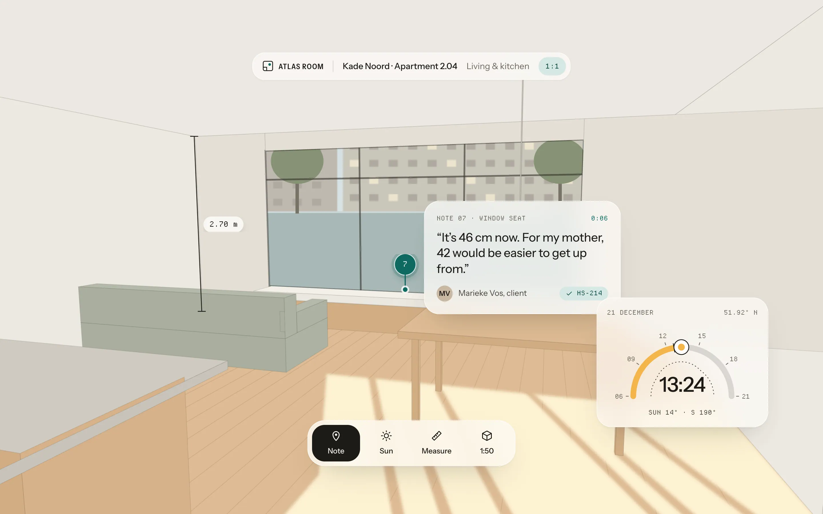
- The Kade Noord client review panel
The brief
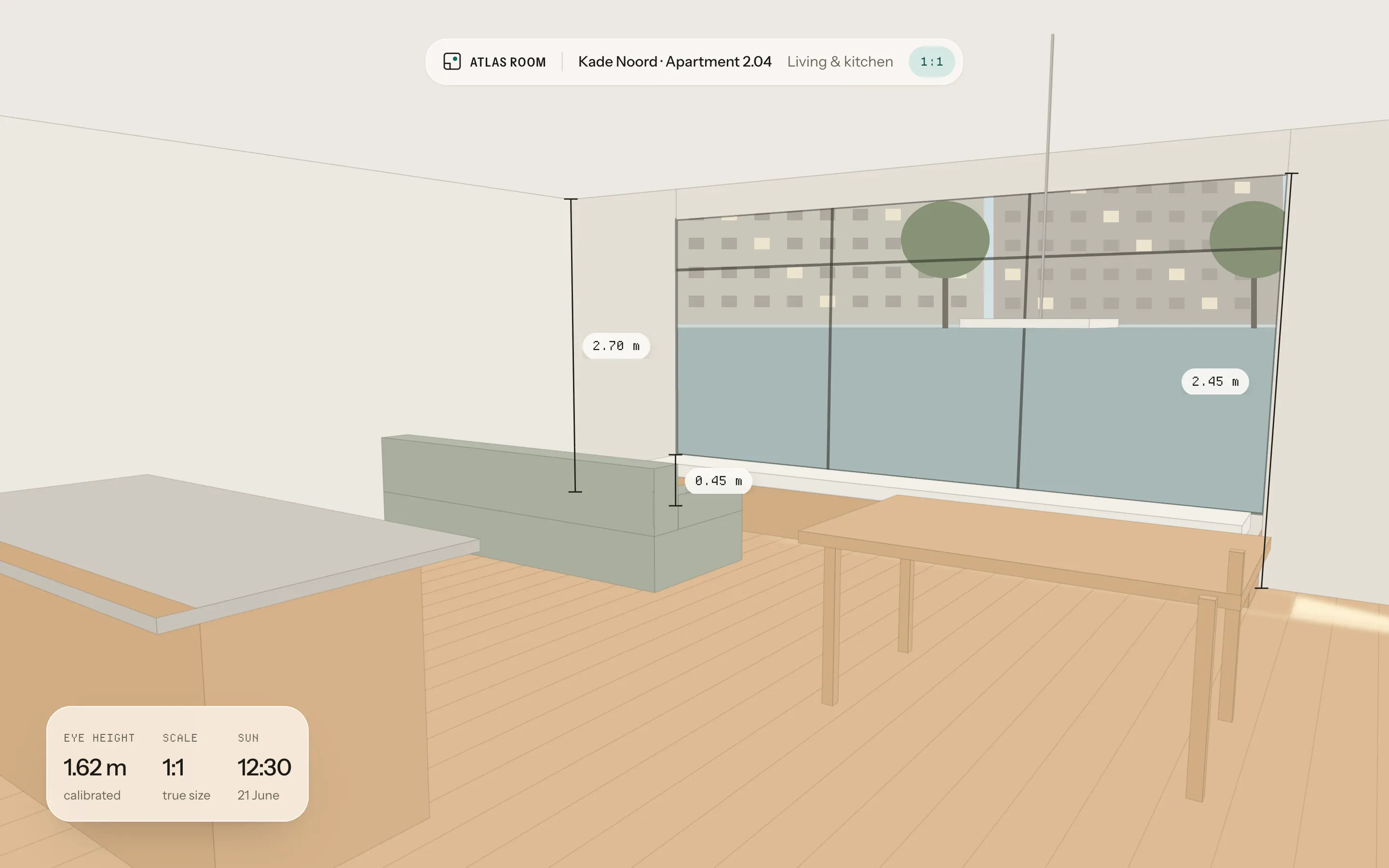
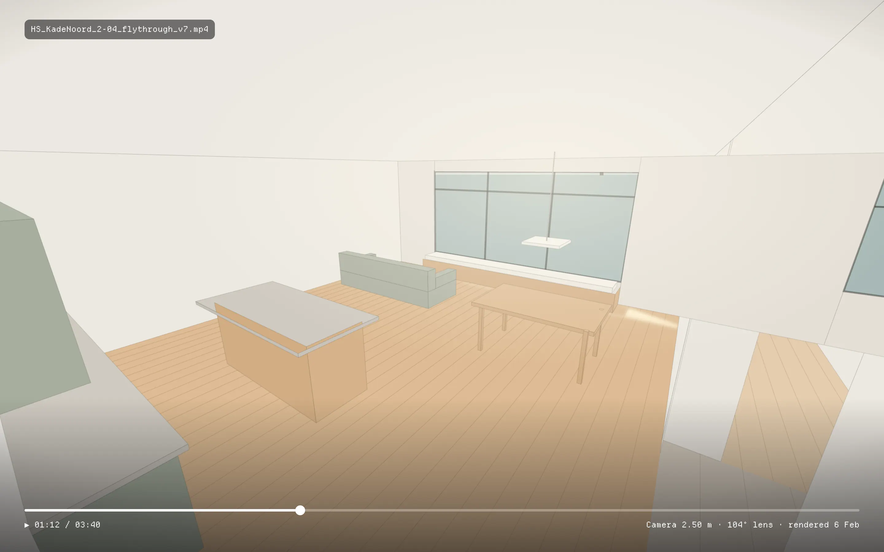
Hollander & Saar review designs with their clients over rendered flythroughs. The films are beautiful and they lie about size: a camera at 2.5 metres with a wide lens makes every room feel generous. Ceiling heights and daylight were signed off in the meeting room and regretted on site, when changing them cost the most.
The constraints were practical. The office owns four headsets, shared between eleven architects. Most clients are buying their first or their last home, are between 40 and 75, and have never worn a headset. And the model had to come straight out of the architects’ BIM tool and load in under two minutes, because nobody sits through a longer wait in front of a client.
Decisions
- 01
Start at 1:1, not in a menu
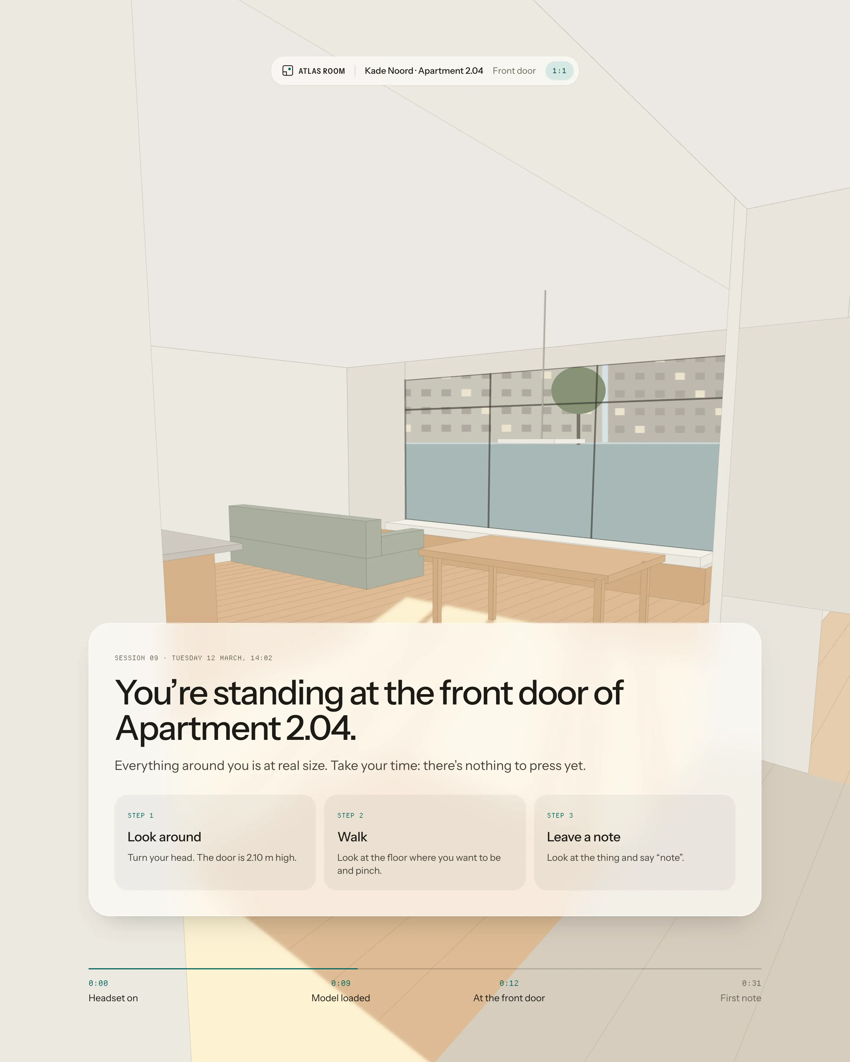
Every session opens standing at the front door of the apartment, at your own eye height. There’s no lobby, no start screen and nothing to press. The first thing clients do is look around, which is exactly what we wanted them to do.
- 02
Notes without hands
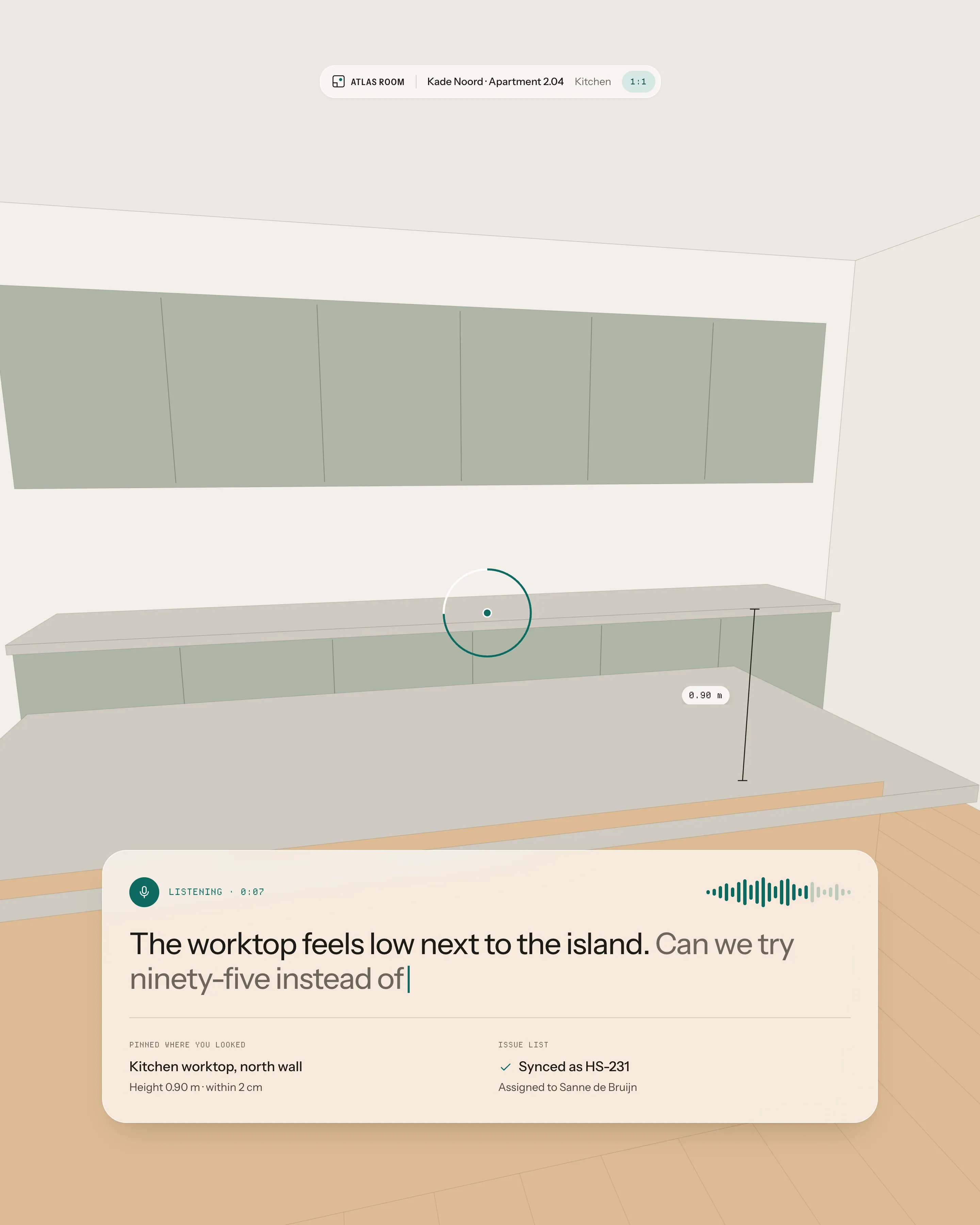
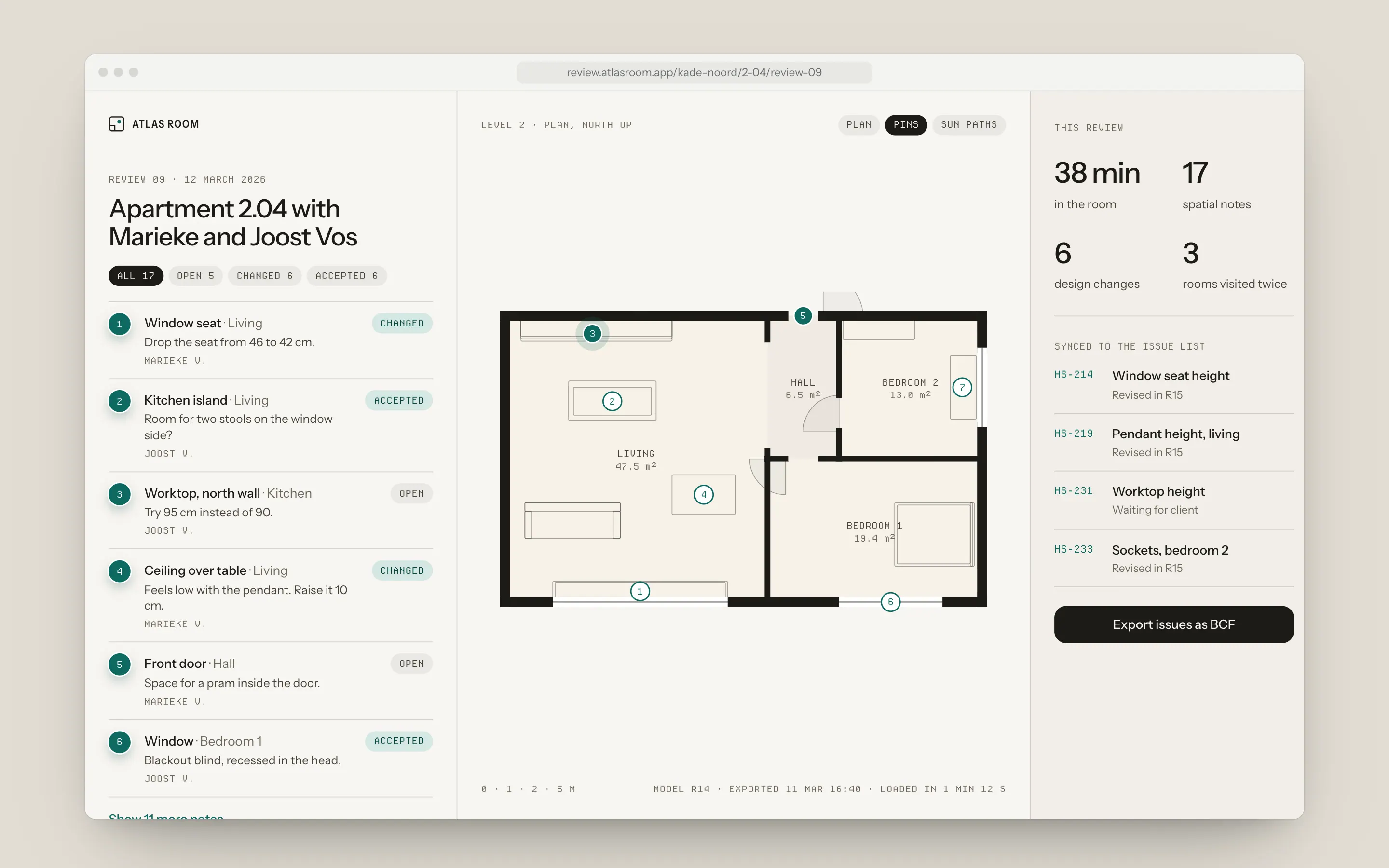
Look at a surface and say “note”. The pin lands where you were looking, within a couple of centimetres, and what you say is transcribed onto it. Each note syncs to the architect’s issue list with its exact position, so nobody has to work out what “that bit by the window” meant after the session.
- 03
A dial for the sun
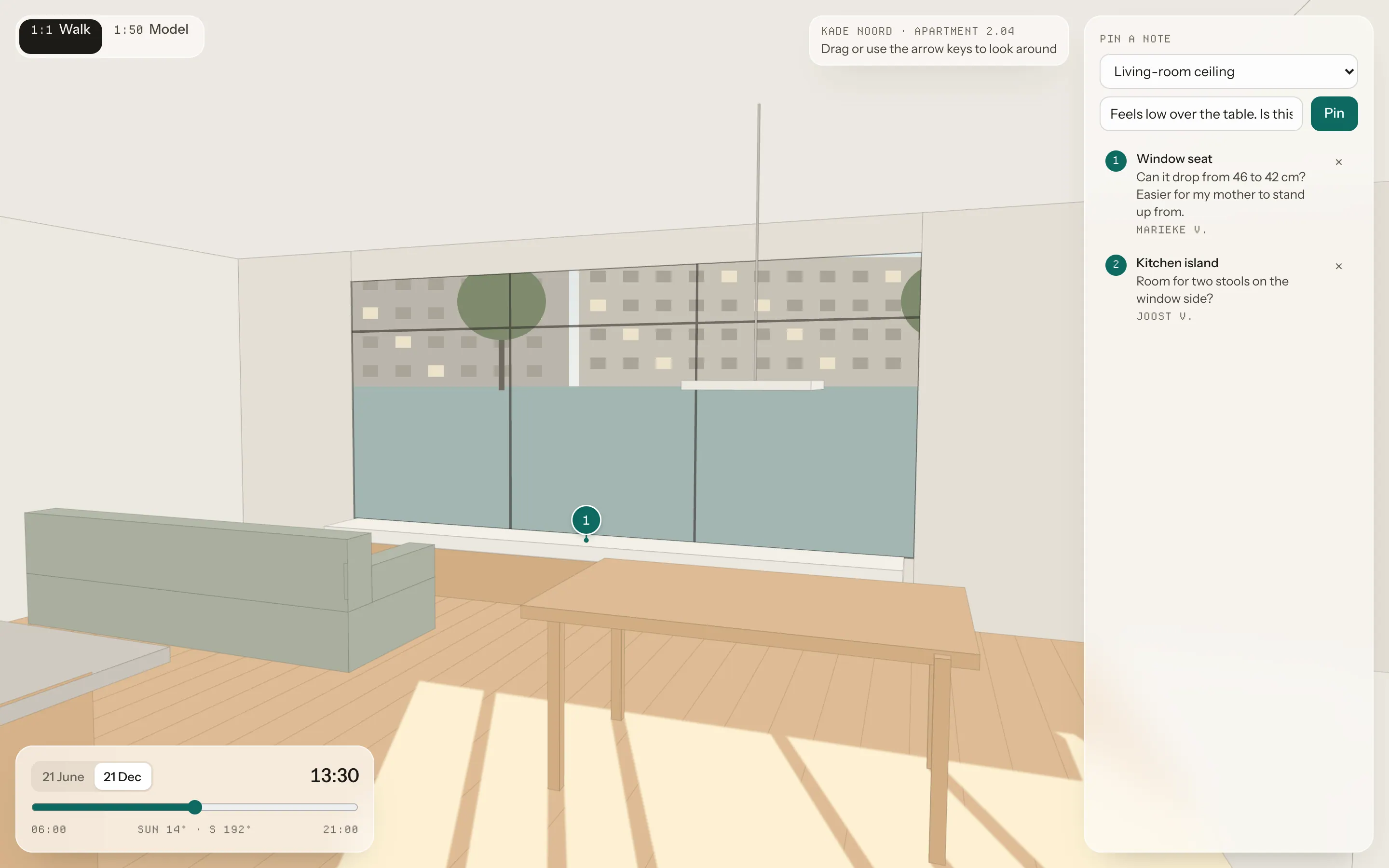
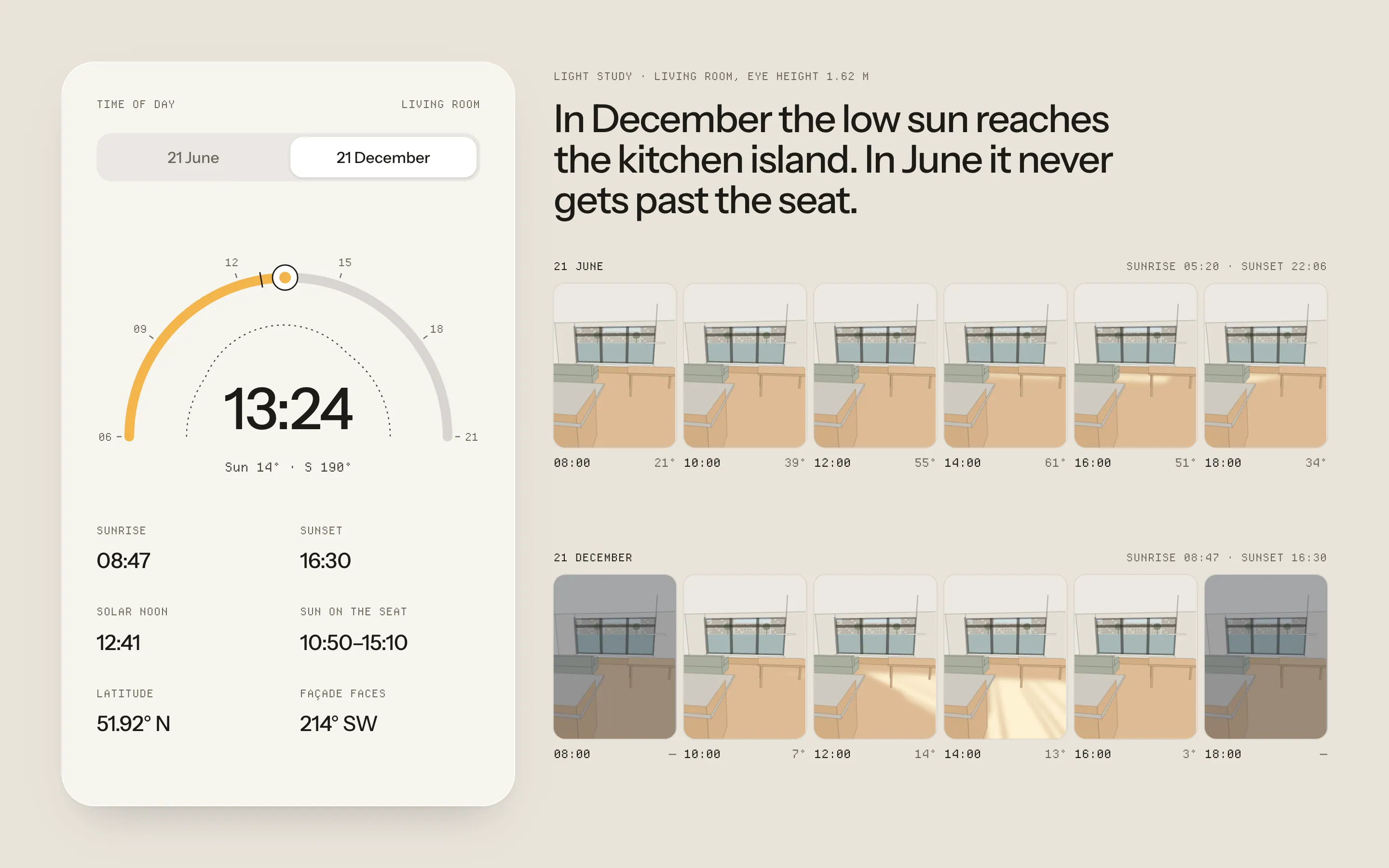
Daylight was the second most regretted decision, so time of day got its own dial. It uses the site’s real latitude and façade orientation, and only two dates, 21 June and 21 December, because the extremes are what people end up living with.
- 04
Shrink the building to find yourself
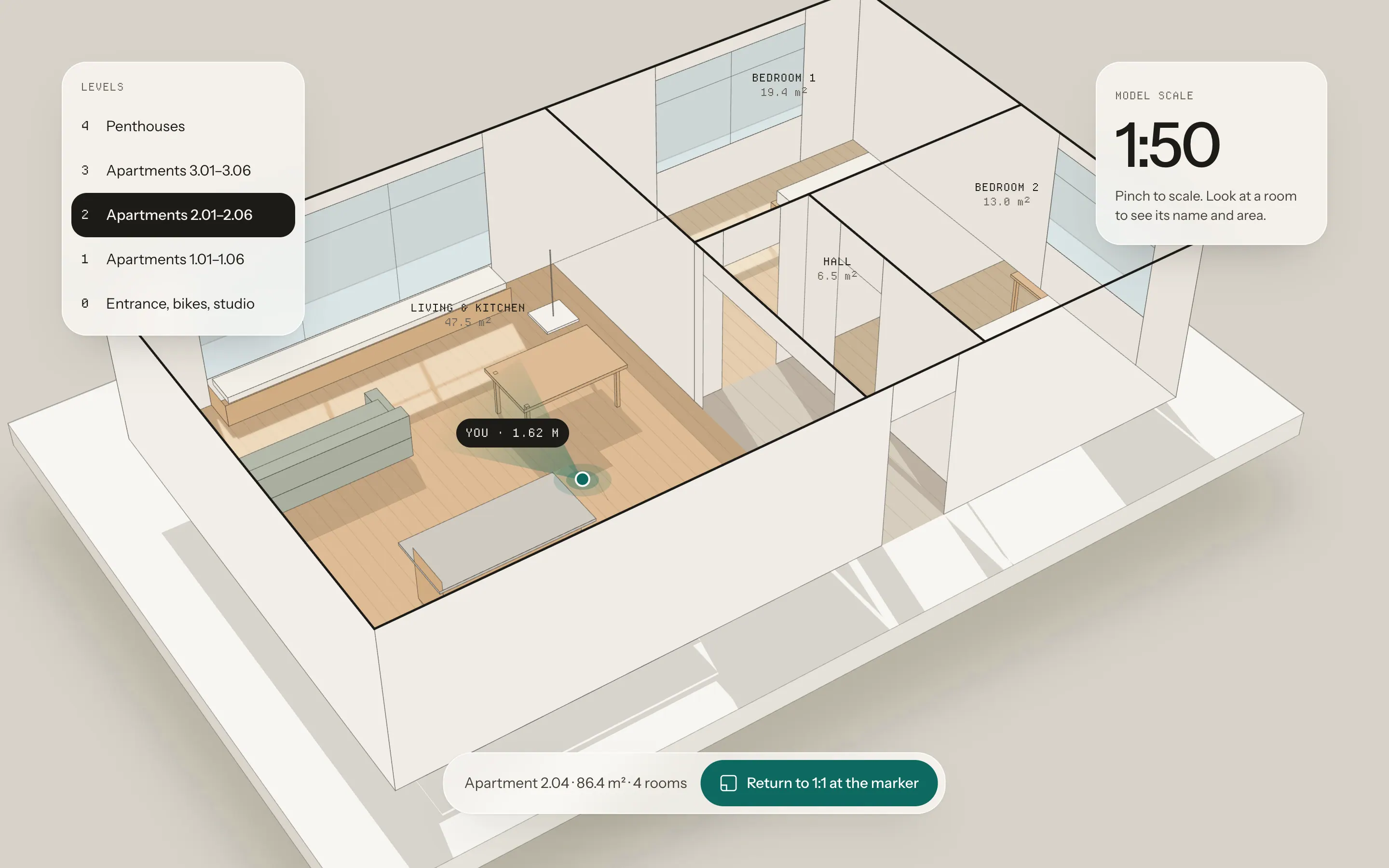
Walking through rooms at full size gets disorienting after a while. A dollhouse toggle shrinks the apartment to 1:50 on the table in front of you, with your position as a glowing marker. One tap puts you back where the marker is.
Outcome
Atlas Room ran in 14 client reviews on the Kade Noord housing project. Late-stage design changes dropped from 23 to 6 compared with the practice’s previous scheme of the same size, because the changes happened earlier: in the room, during the review.
Reviews averaged 38 minutes, about the same as the old flythrough meetings, and clients left 212 spatial notes. The most common kind was about a height: of a seat, a worktop, a pendant, a sill.
Live demo
Walk it, shrink it, move the sun
Try it
The first thirty seconds
Most clients had never worn a headset, so the onboarding was the product. I kept cutting it until there was nothing left to explain: the model loads while the headset is being fitted, and the session begins at the front door with one panel that says where you are and the three things you can do.
Everything else waits until someone needs it. The dock appears when you look down at your hands, and the note tool starts when you say the word.
“We used to spend the first twenty minutes of a site visit explaining why the room felt smaller than the film. Now clients tell us in the review, while we can still do something about it.”
- client reviews on the pilot
- 14
- late-stage design changes
- 23 → 6
- average review
- 38 min
- spatial notes from clients
- 212
What I’d change
Voice notes worked better than I expected and the dollhouse worse. Clients used 1:50 to find their way but rarely to judge anything; the room at 1:1 did that. In the next version the dollhouse becomes a small map on your wrist instead of a mode you switch into.
The two-minute load limit shaped the whole prototype. We strip fittings from the BIM export and replace furniture with simple volumes, which is why the model looks like an architect’s model rather than a render. Clients liked that more than we did.