Case study 06 / 06
Field: ribbon
Editorial design
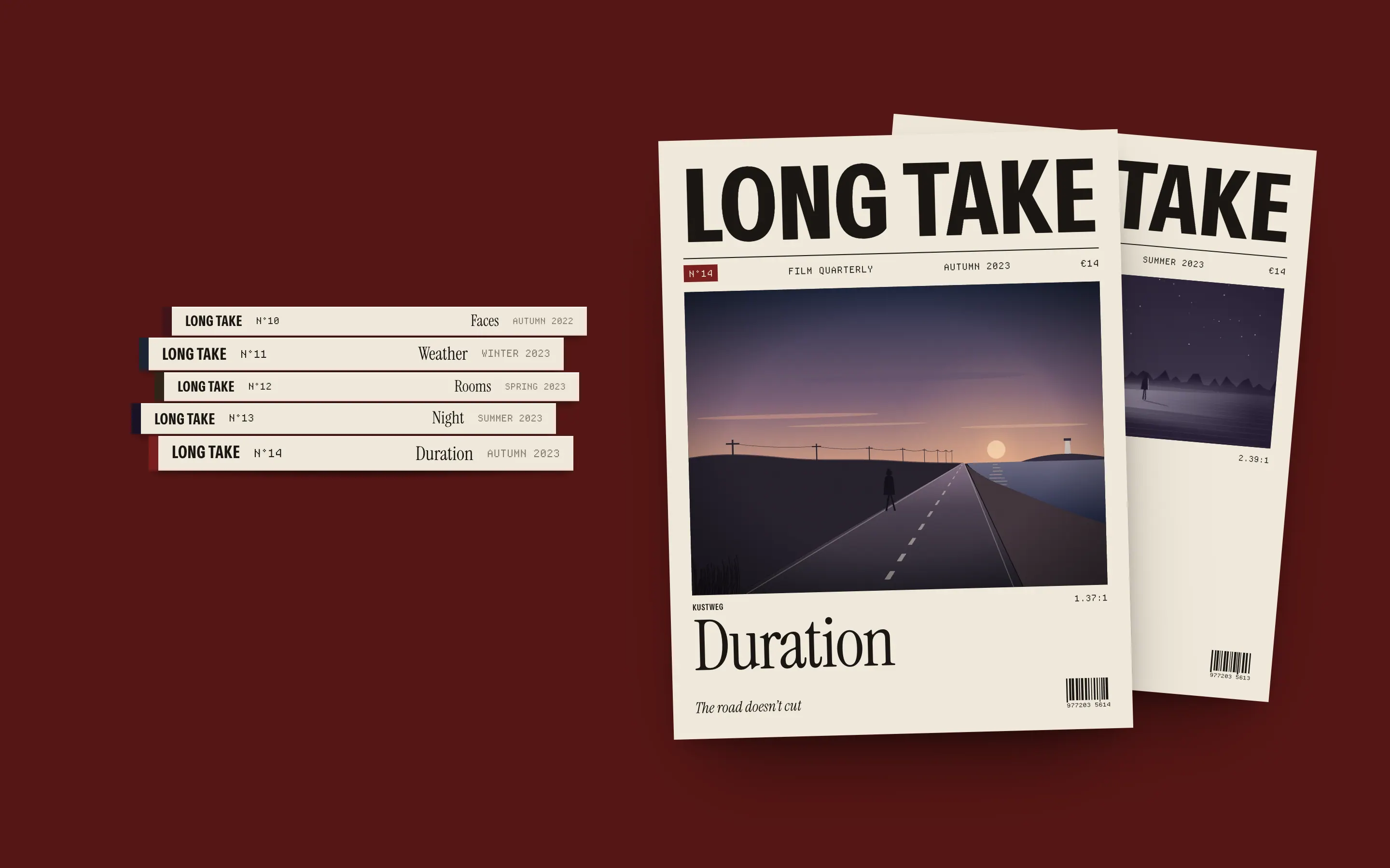
Long Take
A film quarterly whose grid is made of aspect ratios
- Client
- Long Take, Brussels
- Year
- 2023
- Role
- Art direction, editorial design, web
- Team
- Noor Haddad — art direction & web design
- Hanne Claes — editor-in-chief
- Yusuf Demir — picture editor
- Lotte van Dijk — development
The brief
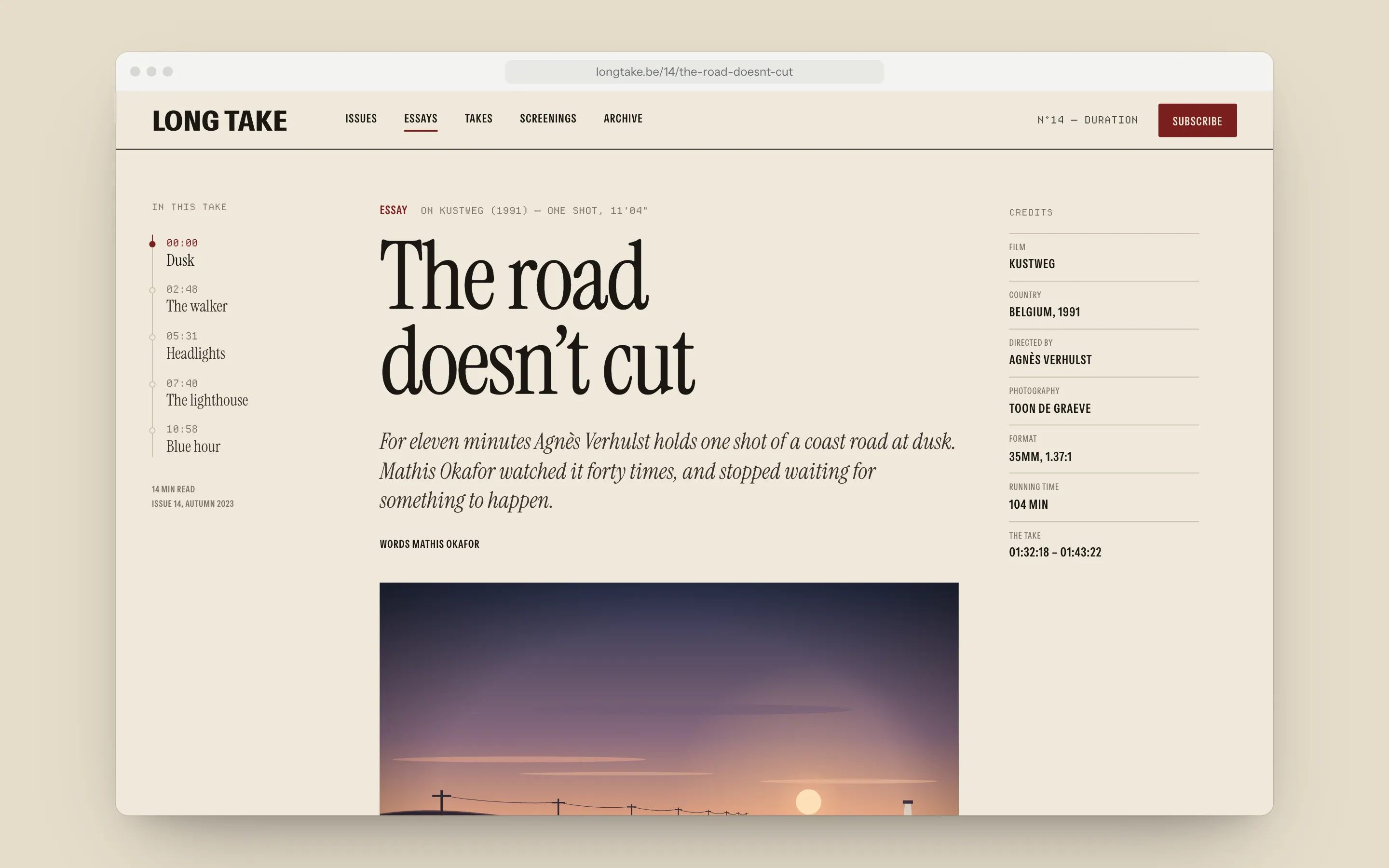
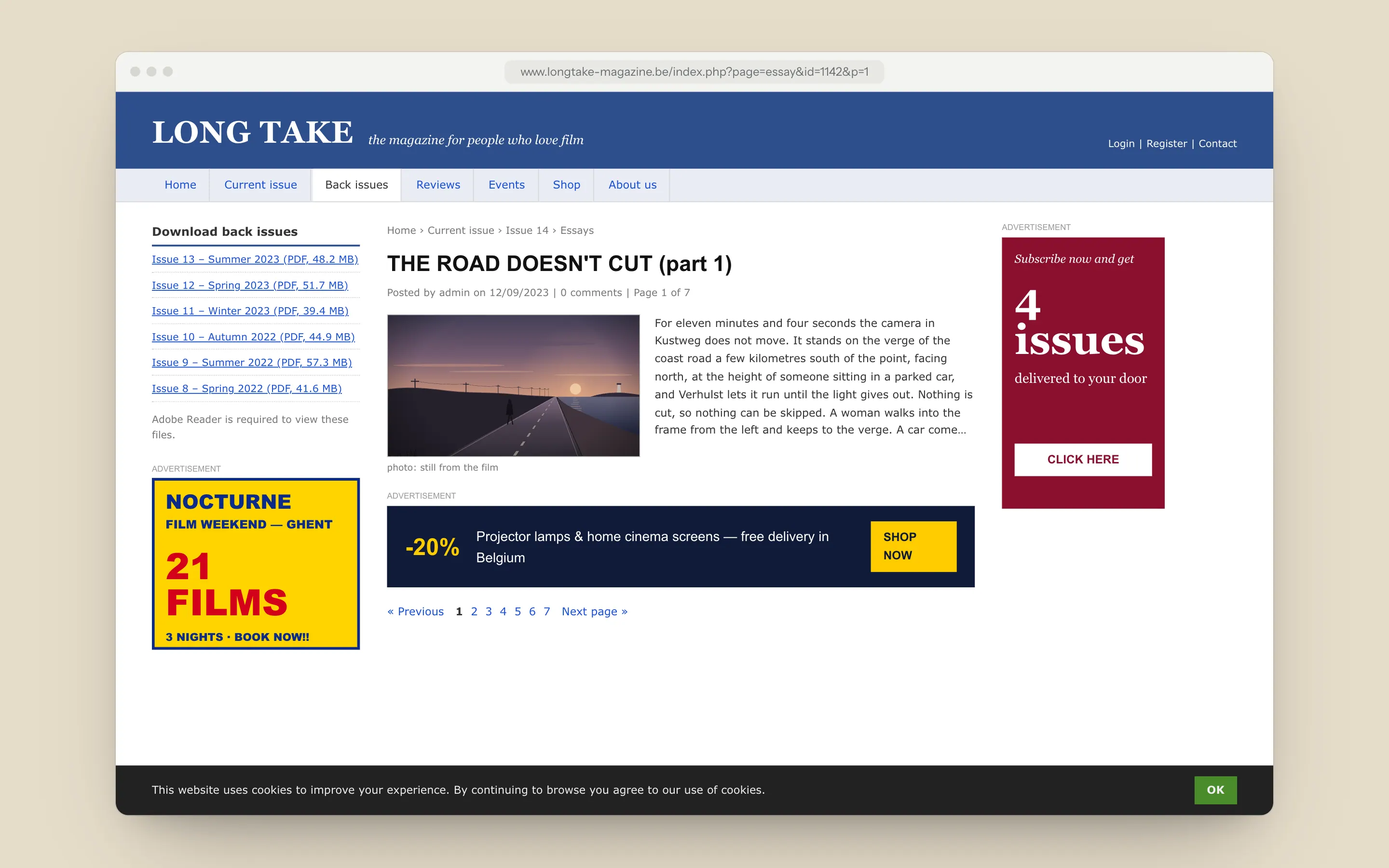
Long Take had 6,000 print subscribers and a website that was a list of PDFs. Its essays about single shots, the thing the magazine is known for, were split into seven pages and run between banner ads. The one idea the magazine cares about, not cutting away, was the first thing the website did to every essay.
The constraints were real. The team is four people who think in print first. Most stills are licensed only at specific crops, usually the film’s own ratio, so I couldn’t resize pictures to suit a layout. And there was budget for one developer for three months, for print and web together.
Decisions
- 01
Aspect ratio as grid
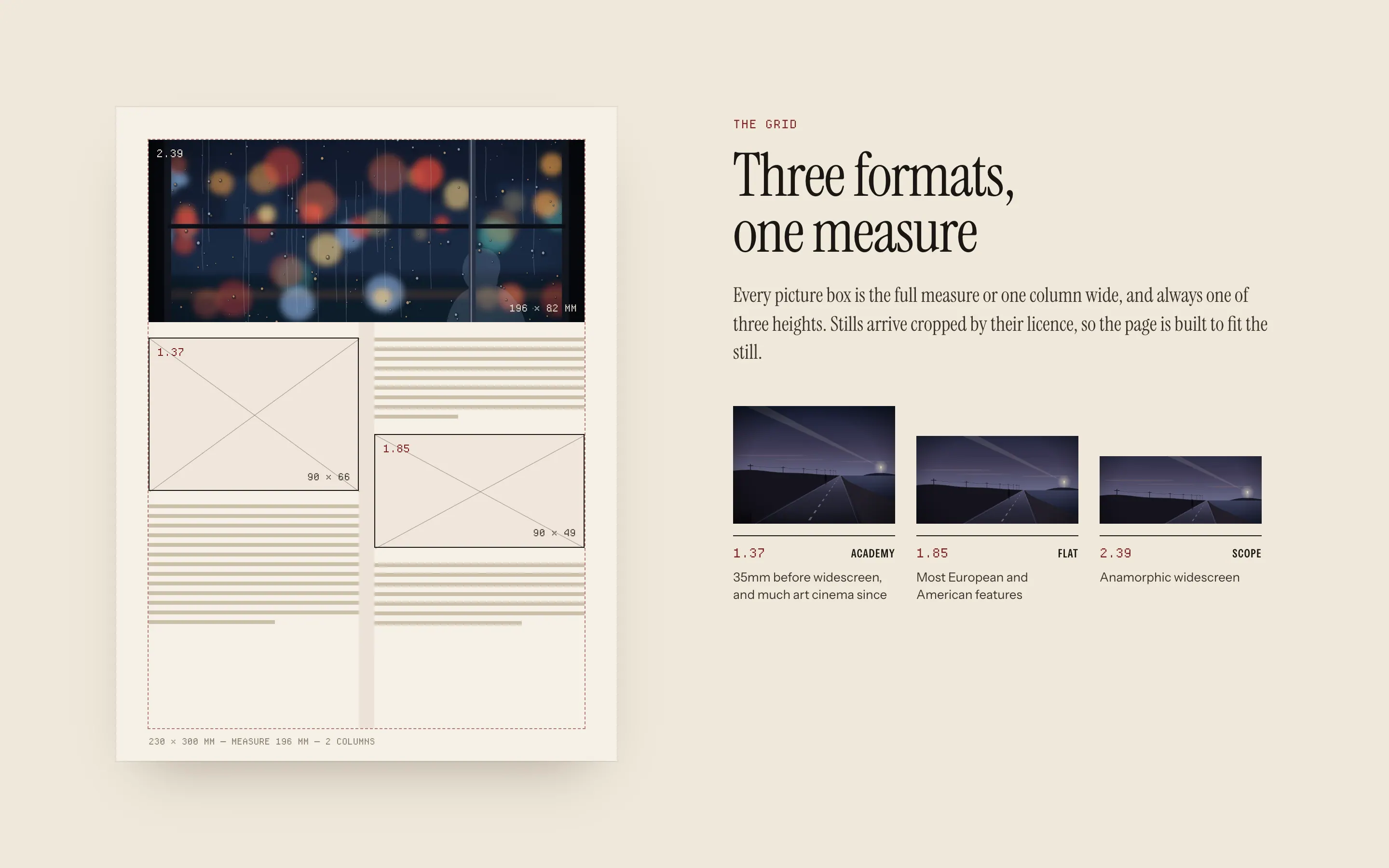
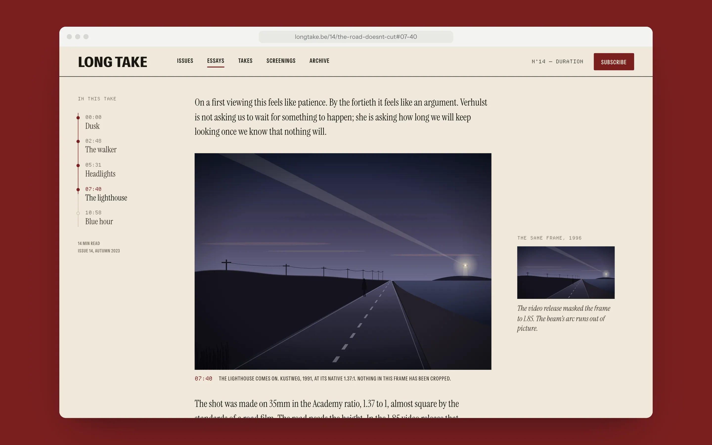
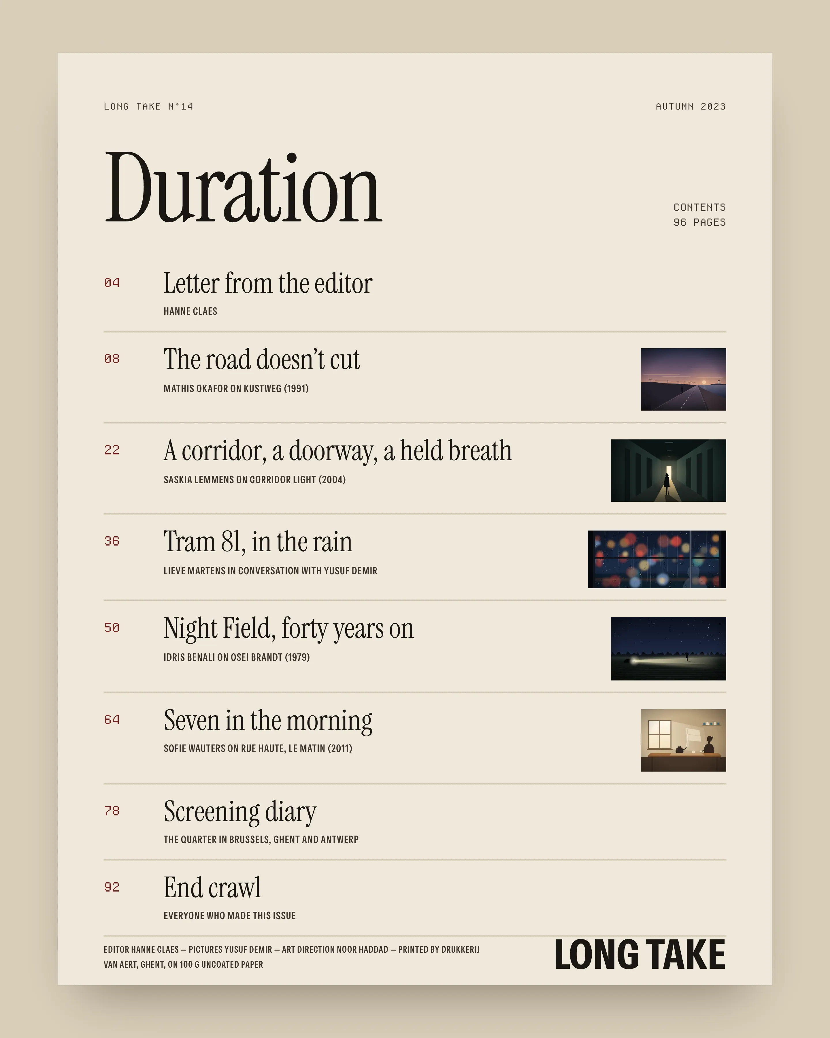
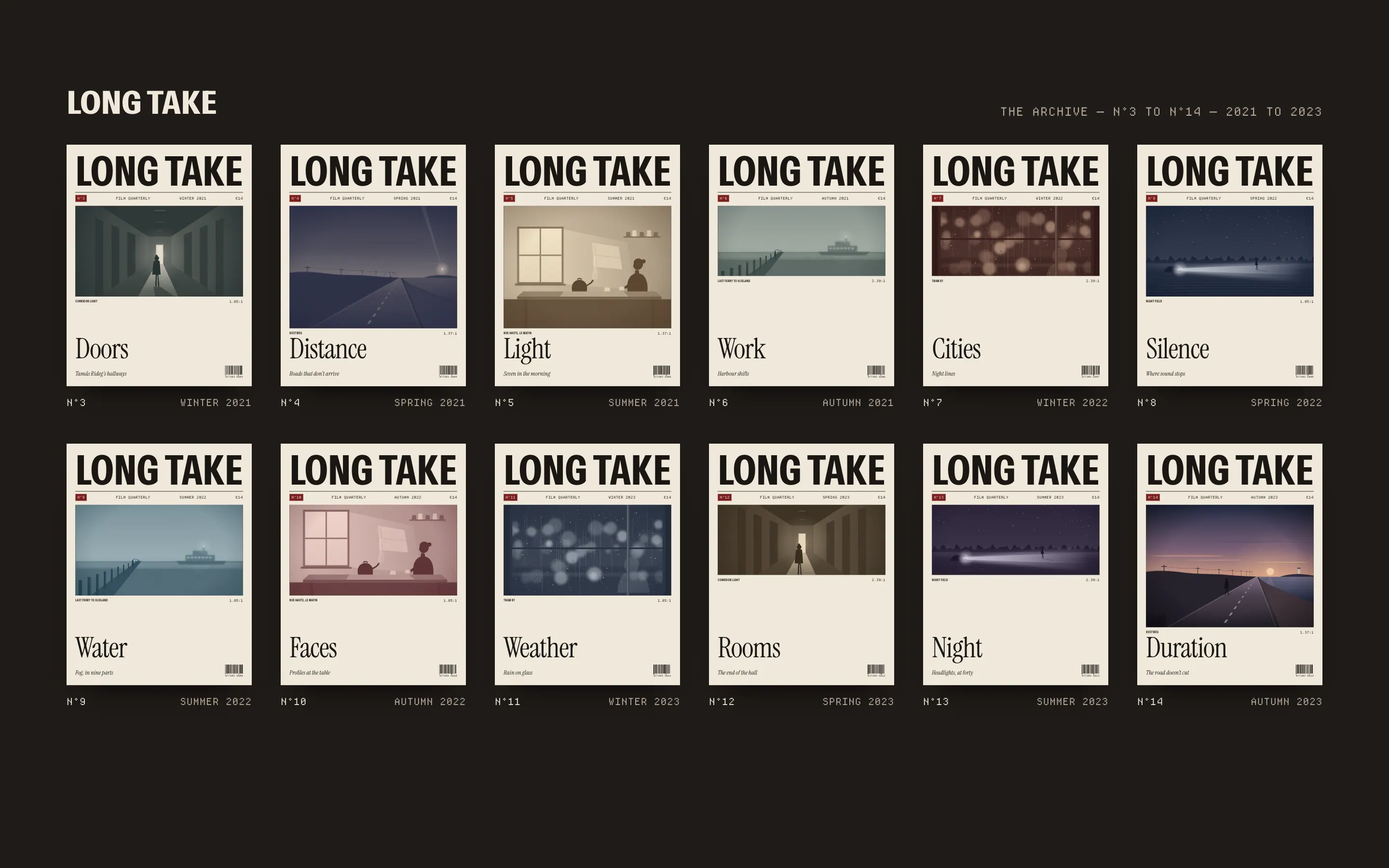
I built the print grid from film formats before columns. Every picture box is the full measure or one column wide, at one of three heights: 1.37, 1.85 or 2.39. A still always sits at its native ratio, so Yusuf never has to ask a distributor for a different crop, and every page shows how the film was shot.
- 02
Takes
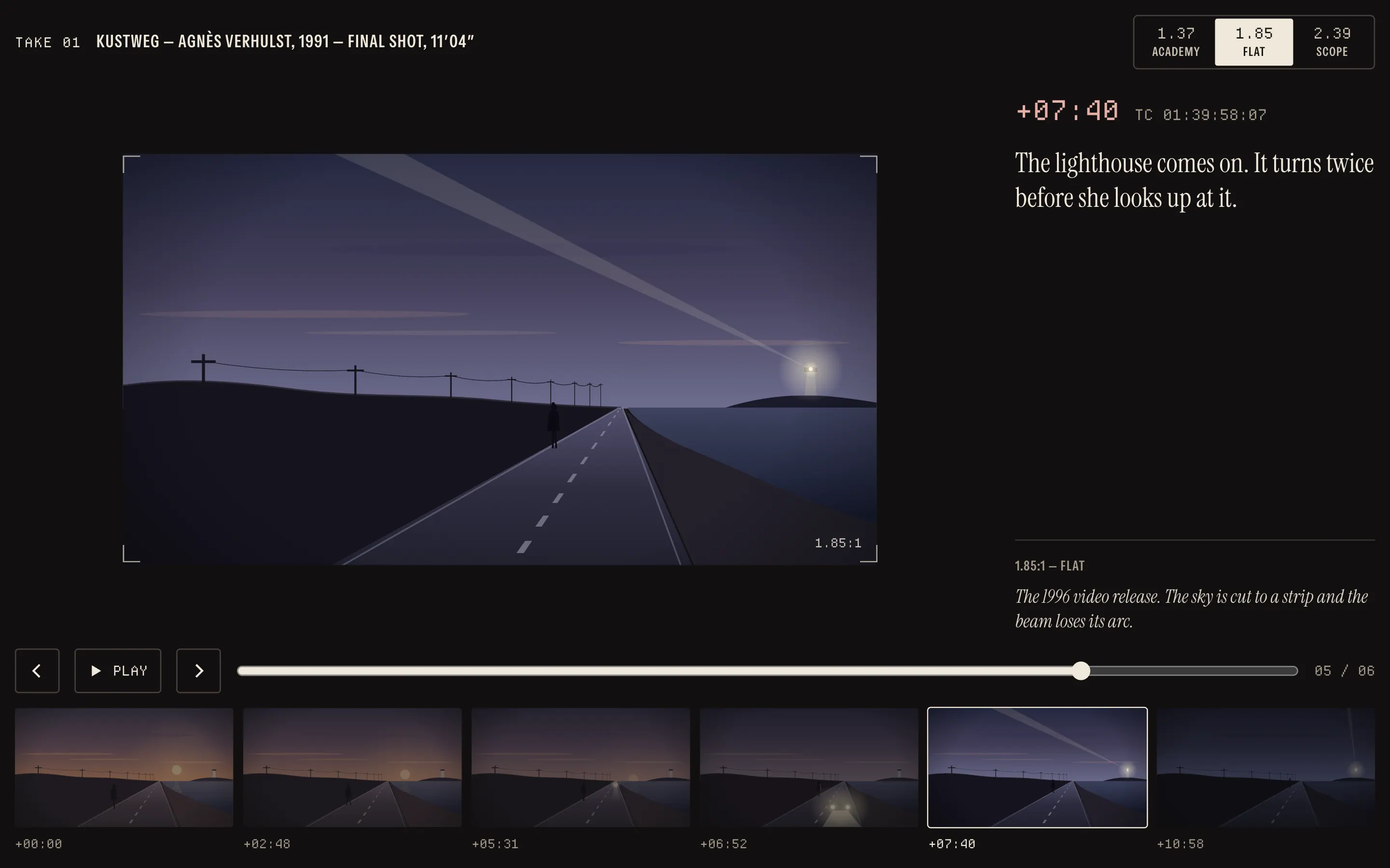
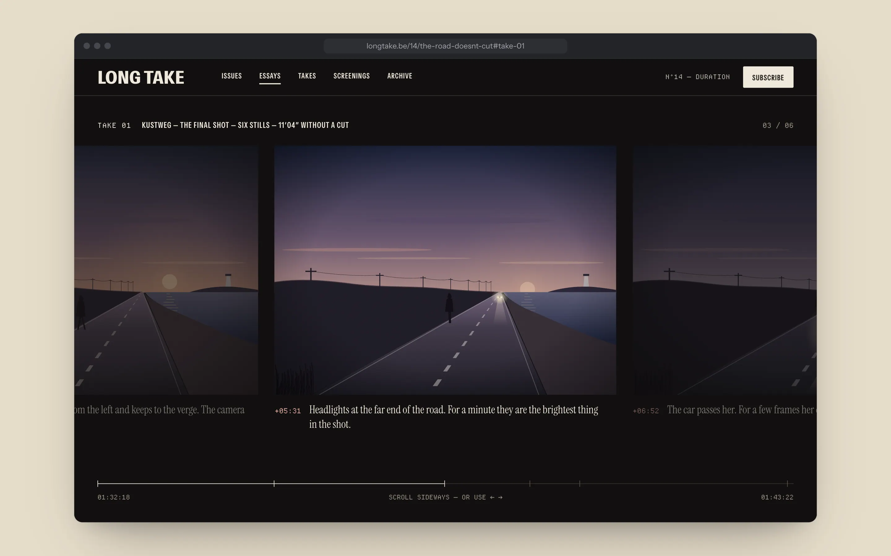
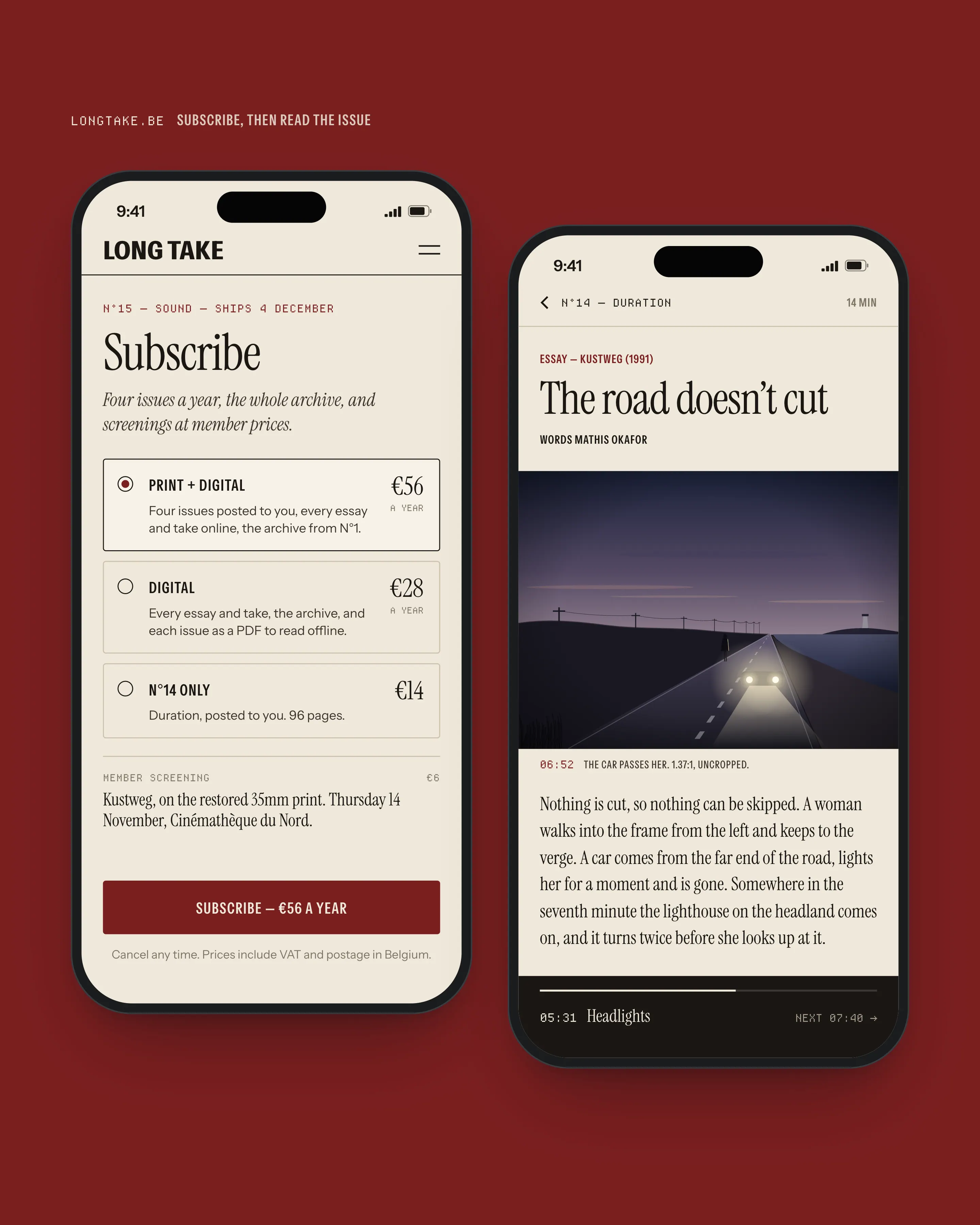
On the web, an essay pauses for a take. The page dims like a cinema and a sequence of stills from the shot under discussion runs sideways, uninterrupted, with its timecodes. You can scroll it, step through it with the arrow keys or let it play.
- 03
Type from the cinema
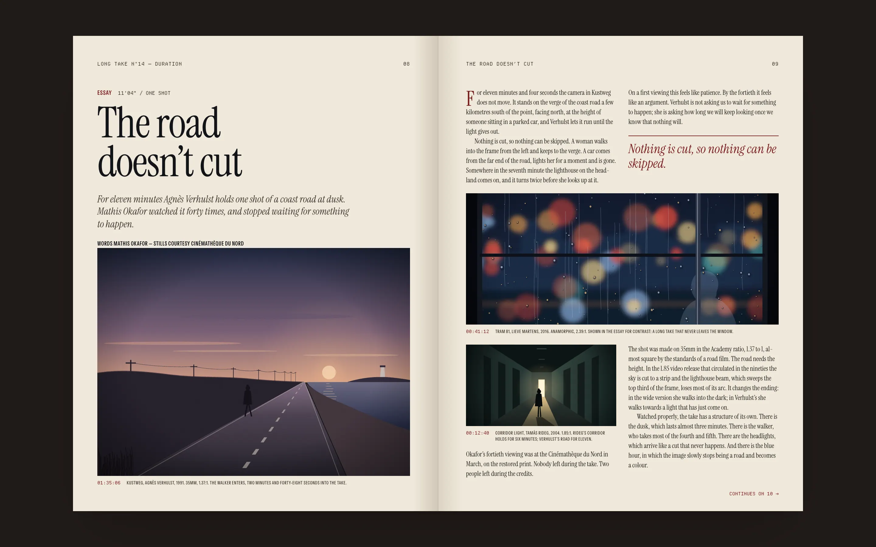
Instrument Serif sets the essays, with the warmth of an old cinema programme. A condensed grotesque sets the masthead, captions and credits like an end crawl. Departure Mono carries every timecode, so numbers that refer to the film look like they came off a screen.
- 04
Timecodes as navigation
Each essay’s sections are marked with timecodes from the film it discusses. The rail beside every essay is a table of contents and a position in the shot at once: 07:40 is both “The lighthouse” and how far into the take you are.
Outcome
The relaunch issue, N°14, went out in September 2023 with the new site. In the first six months web readership rose 3.2 times, and readers stayed an average of 11 minutes on an essay. On the old site most of them left after the first of seven pages.
Print subscriptions rose 18% after the relaunch issue, which mattered more to the magazine than any web number: the site now works as the trailer for the paper. Lotte built it in eleven weeks, and the four of them now put each new issue online in a day.
Live demo
Take viewer
Try it
Lights down
The dark take section started as a joke in a meeting: what if the page turned the lights off? It stayed because it does a job. Readers move from reading to looking, and the change of colour tells them the rules have changed. The text stops, the pictures run, and nothing is cut until the take ends.
It also solved the licensing problem on screen. A take shows each still at its native ratio inside the same frame, so a 2.39 shot and a 1.37 shot can sit in one essay without either being cropped to match the other.
“We used to apologise for our pictures. Every still was the wrong shape for the page. Now the page is the shape of the pictures, and readers notice before they can say why.”
- Web readership in the first six months
- 3.2×
- Average time on an essay
- 11 min
- Print subscriptions after N°14
- +18%
- Stills cropped to fit a page
- 0