Case study 01 / 06
Field: contour
Generative identity
Veld Kunsthal
An identity that redraws itself from every exhibition’s floor plan
- Client
- Veld Kunsthal, Utrecht
- Year
- 2025
- Role
- Identity system, creative code, type
- Team
- Noor Haddad — design & code
- Ilse Brandsma — head of communications, Veld
- Tomás Lindqvist — type engineering
- Drukkerij Kaap — risograph printing
The brief
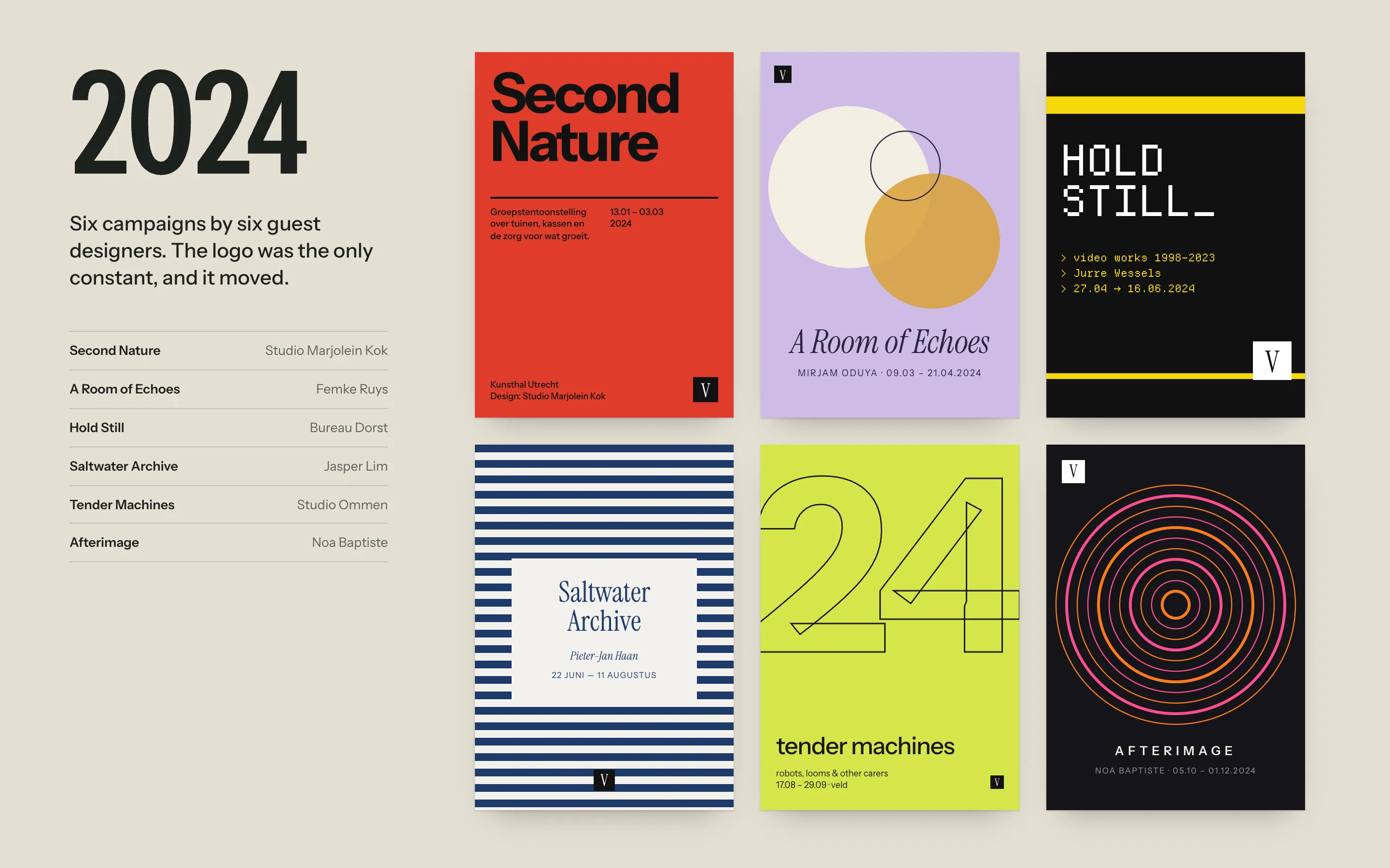
Veld Kunsthal runs eleven exhibitions a year with a communications team of two. Until 2024 every show got a guest designer and its own look, held together by a small square logo that moved from corner to corner. Eleven good campaigns a year added up to no identity at all: in a street survey, fewer than one in five people could match a Veld poster to Veld.
The constraints were plain. There was no budget for agency work per show. The team doesn’t use design software day to day. And everything printed goes through Drukkerij Kaap, a risograph studio in Lombok, which means two spot inks and a fixed set of drums.
Decisions
- 01
The building is the seed
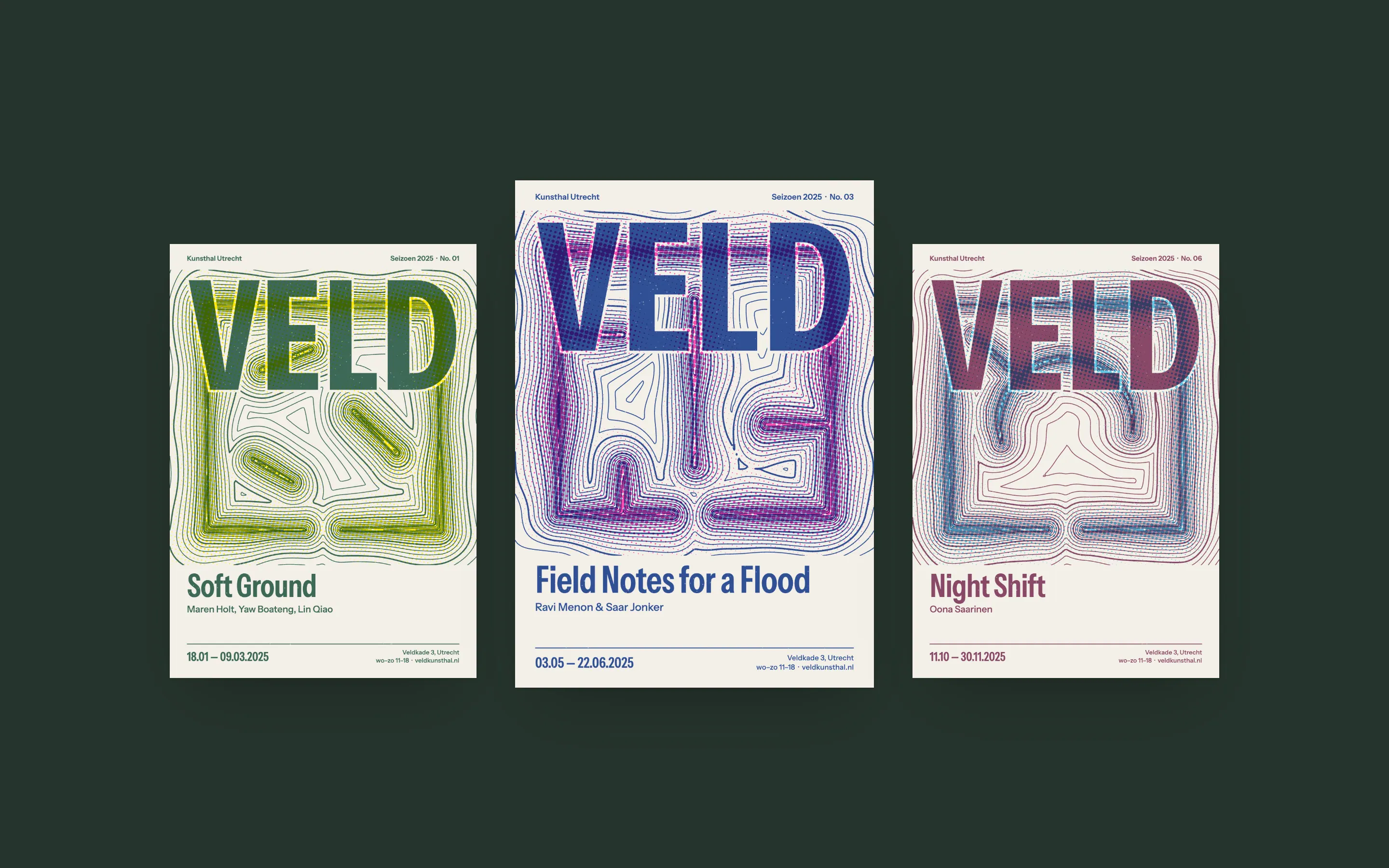
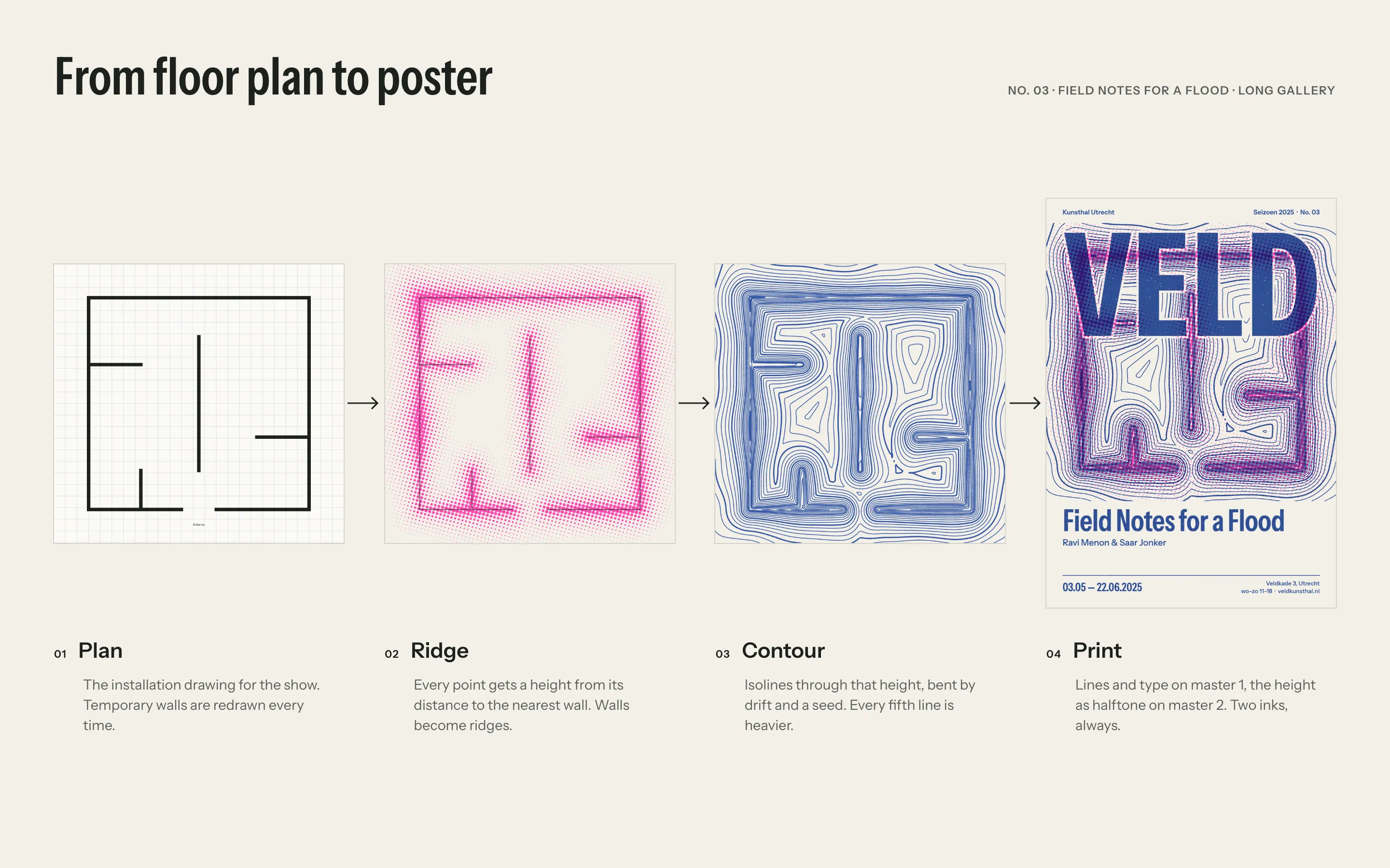
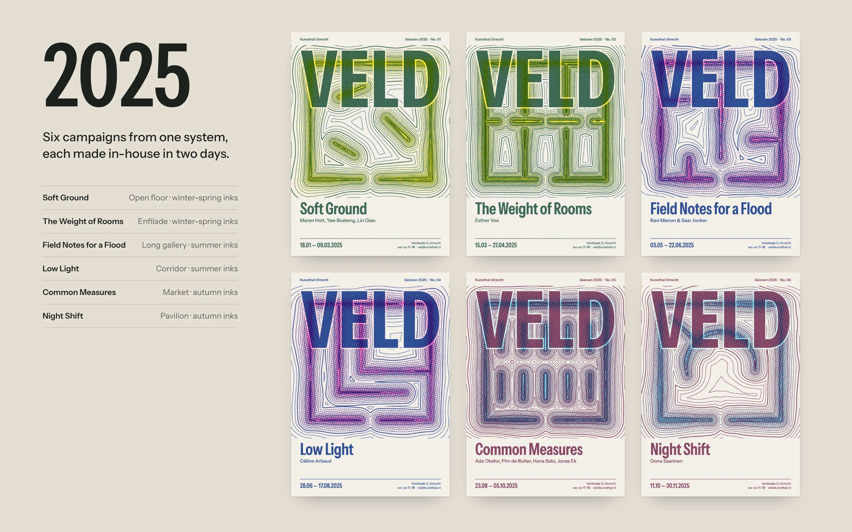
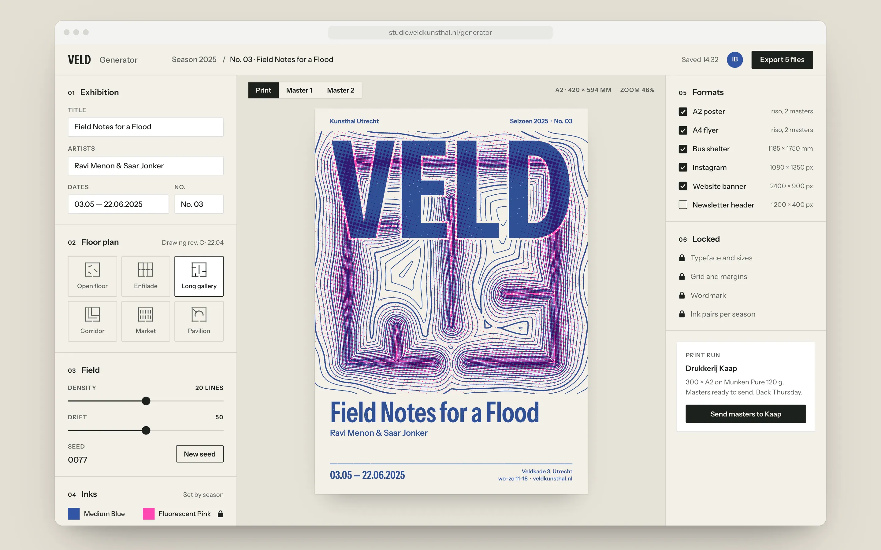
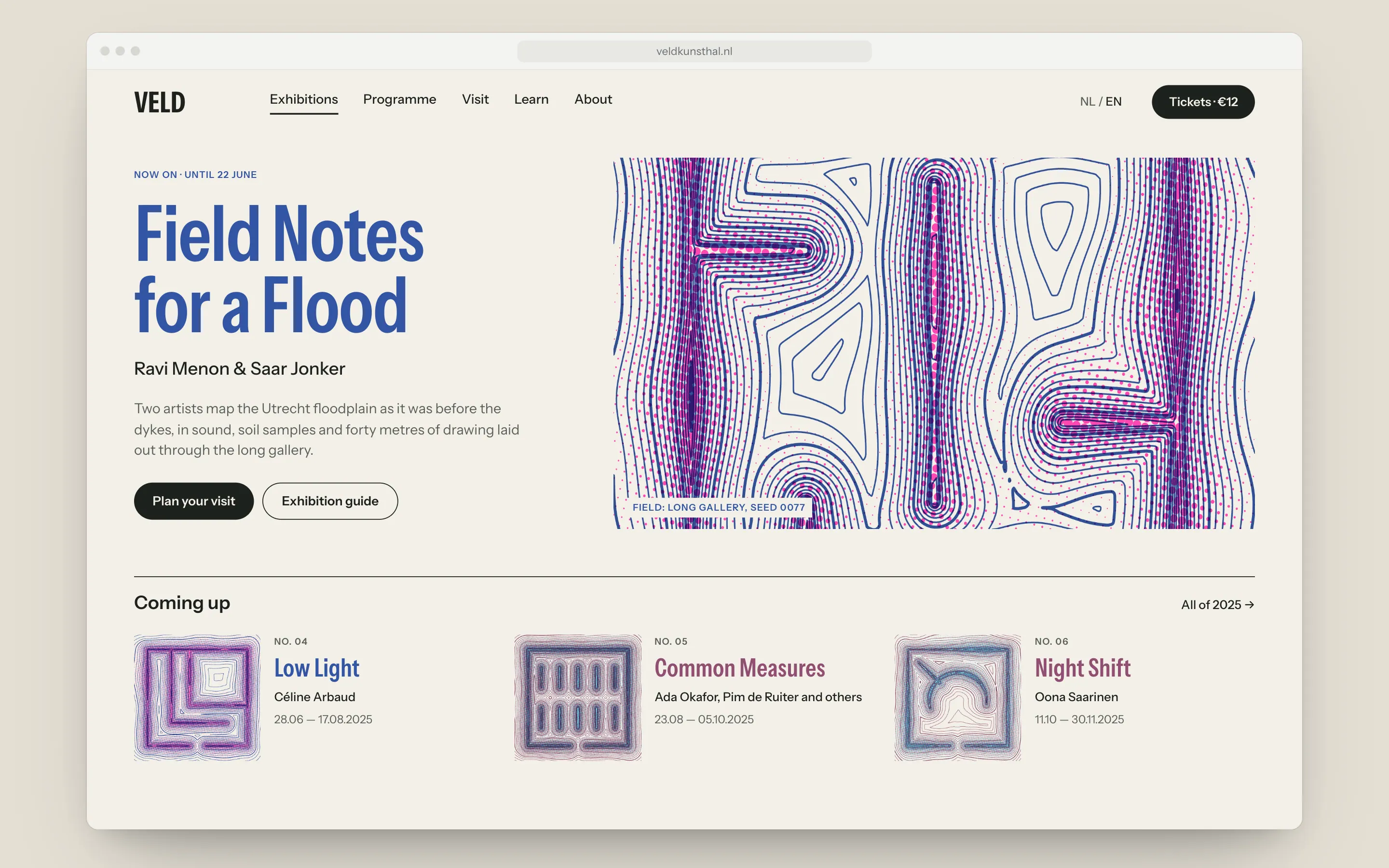
Every show at Veld is built from temporary walls, so every show already has an installation drawing. I use that drawing as the input. Each point on the poster gets a height from its distance to the nearest wall, so walls become ridges and the contour lines flow around them. Same algorithm, a different building each time: the posters are related without being the same.
- 02
Two inks, always
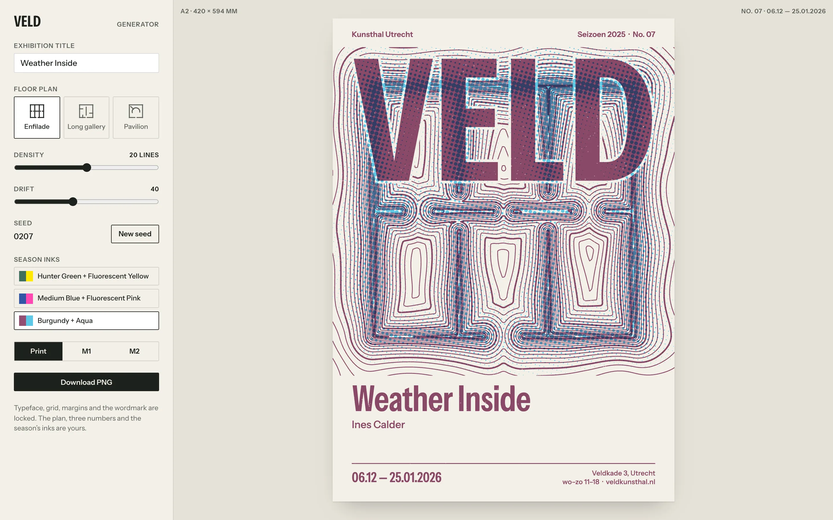
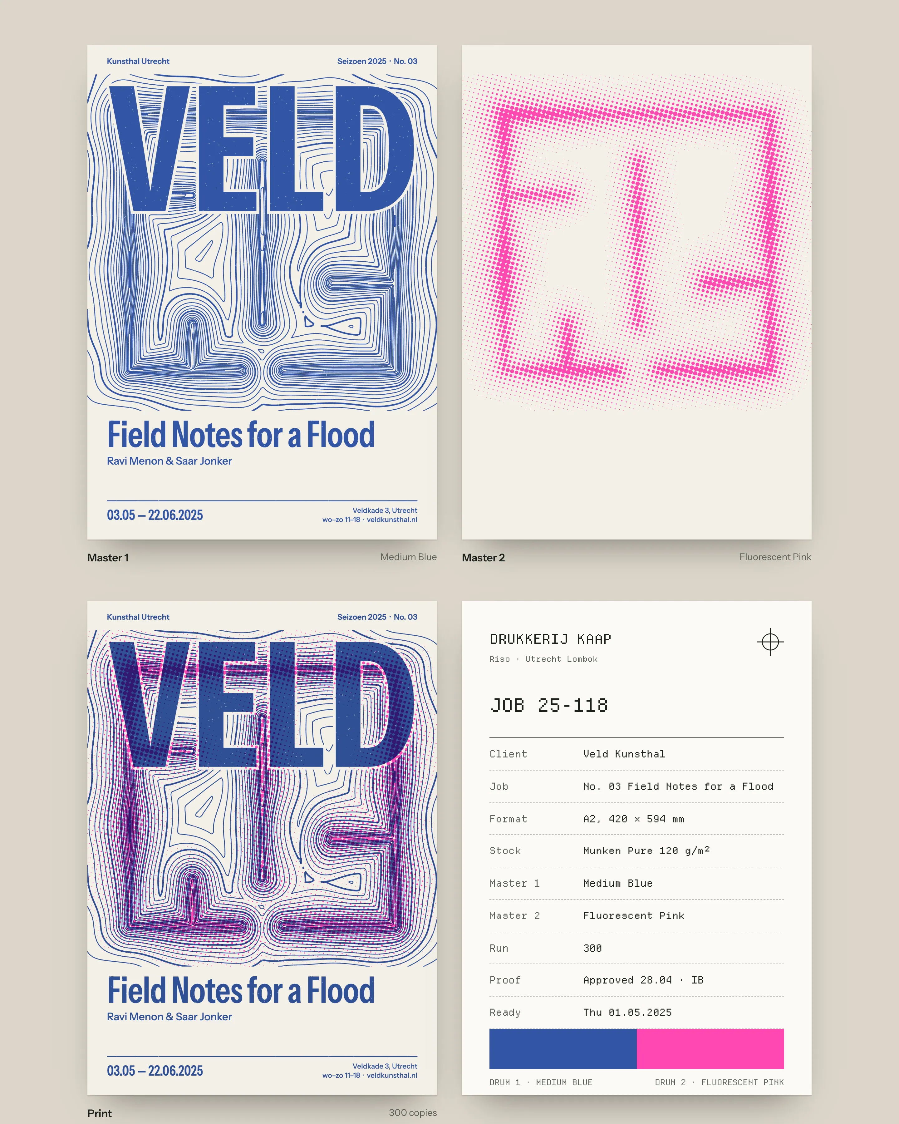
The generator never outputs more than two layers: contour lines and type on master 1, the height as a halftone on master 2. Files go straight onto Kaap’s drums with no separation work. Each season has its pair (Hunter Green with Fluorescent Yellow, Medium Blue with Fluorescent Pink, Burgundy with Aqua), and on screen those two inks are the whole palette.
- 03
A tool, not a template
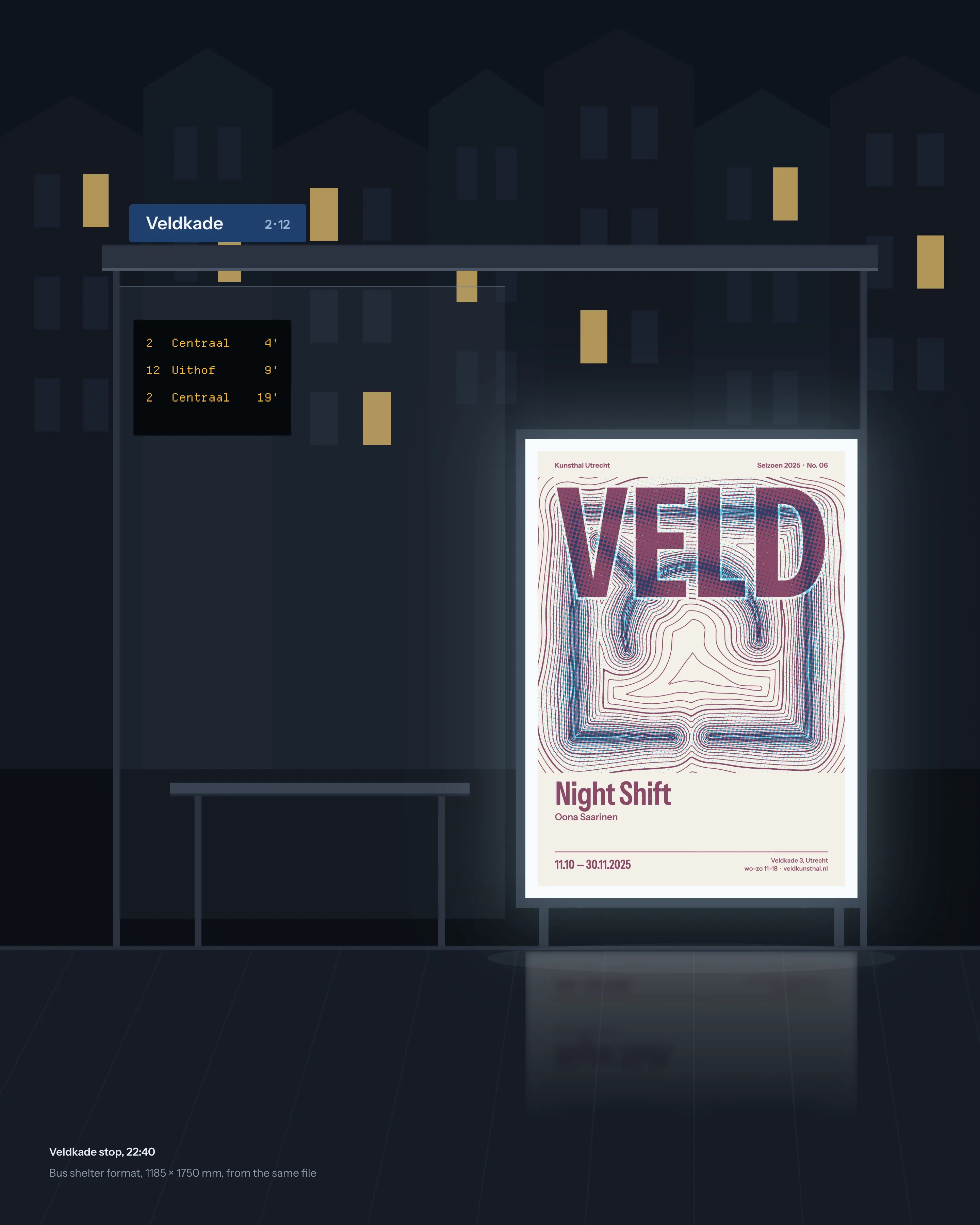
The team gets a browser tool with three controls, density, drift and seed, plus the plan and the show details. Typeface, grid, margins and wordmark are locked. It is very hard to make a bad Veld poster and easy to make one that feels like yours. One file exports to A2, flyers, bus shelters, Instagram and the website.
- 04
A wordmark with room for the field
VELD is set in a condensed grotesque, wide enough to carry the top of every poster. A thin paper halo keeps it readable on any field, and the contour lines keep running through its counters, so the mark shifts a little with every show too.
Outcome
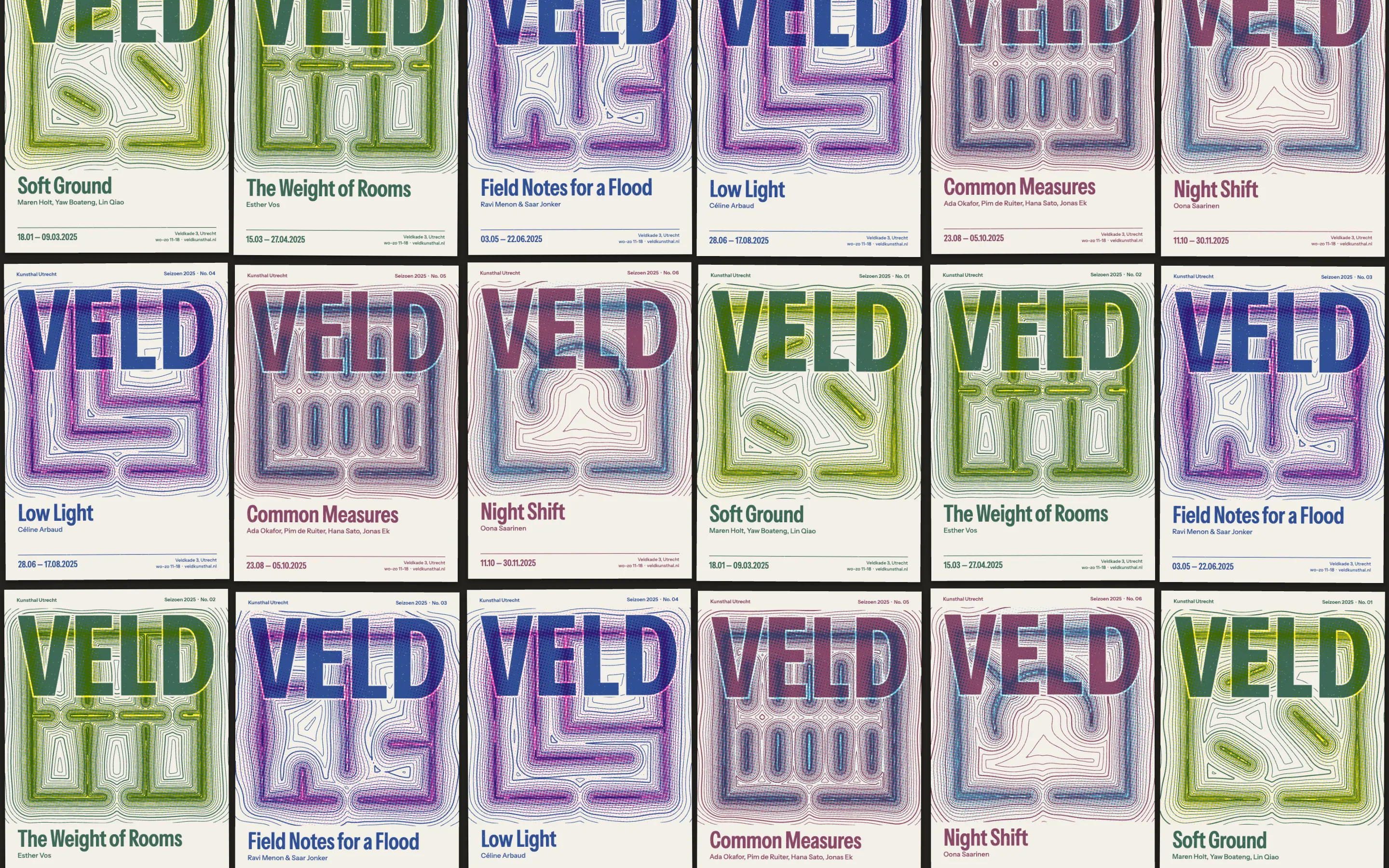
The first season under the system ran from January to November 2025. Ilse and her colleague made all eleven campaigns in-house, and the time from installation drawing to printed poster dropped from about three weeks to two days. Veld spent nothing on agency fees for campaign design.
In the autumn street survey, 64% of people recognised a Veld poster with the logo covered, against 18% the year before. Next season the generator gets one new input: the sound map Veld records at each opening, which will bend the field the way the crowd moved.
Live demo
Make a Veld poster
Try it
What a campaign day looks like
A campaign starts when the exhibition designer signs off the installation drawing. Ilse imports it, types the title and dates, and spends ten minutes with the curator trying seeds. Drift is the only real argument: low drift keeps the rooms legible, high drift lets the topography take over.
When they agree, one button writes the two masters and the digital formats. Kaap prints 300 A2 posters by Thursday, and the shelter files go to the city’s media contractor the same afternoon.
“We used to brief a designer, wait three weeks and hope. Now I open the drawing on Tuesday, try twenty seeds with the curator over coffee and send the masters to Kaap that afternoon.”
- campaigns made in-house in 2025
- 11/11
- from installation drawing to printed poster, down from three weeks
- 2 days
- recognised a Veld poster with the logo covered, up from 18%
- 64%
- spent on agency fees for campaign design
- €0